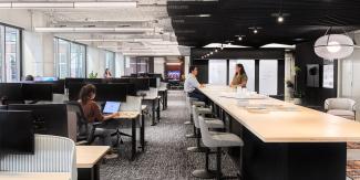
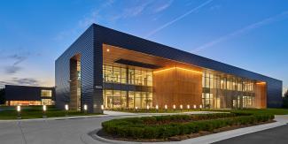
Celebrating over 100 years of heritage as a trusted advisor, Taft Stettinius & Hollister, LLP (Taft) is more than a venerable firm with an outstanding heritage. The firm prides itself as a progressive, forward-thinking and modern law firm. Finding themselves out of space, they teamed with HED to plan and design an expansion and reimaging of their space within the iconic Mies Van der Rohe building in Chicago, IL. HED’s design solution incorporates Taft’s goals to create a workplace that reflects their unique legacy and brand, their client-first culture, and connects their global leadership and talent teams through a flexible and amenity-rich space.
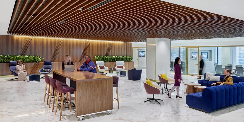
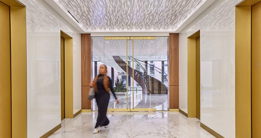
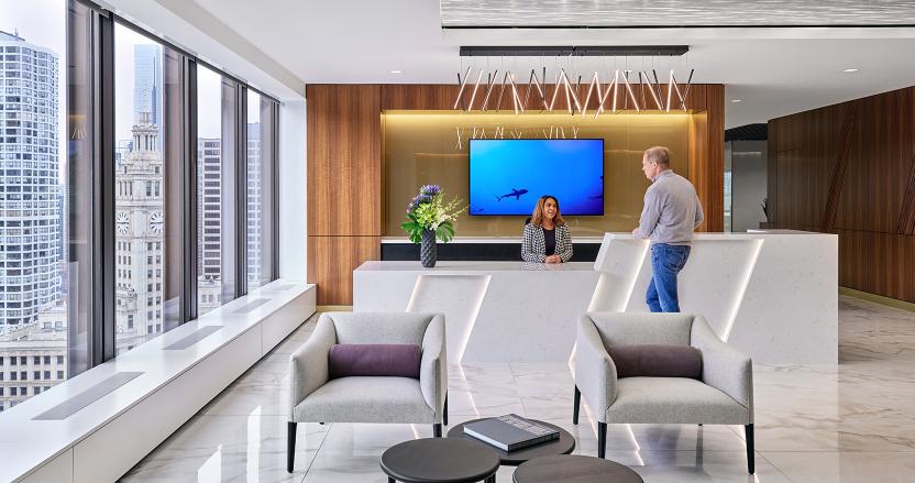
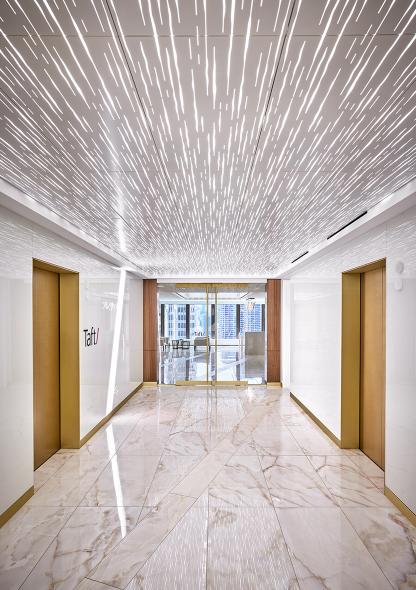
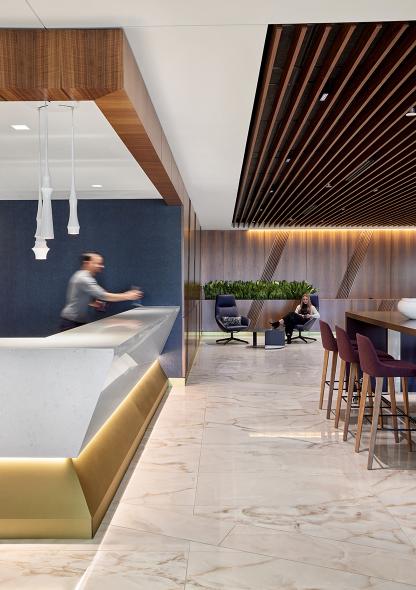
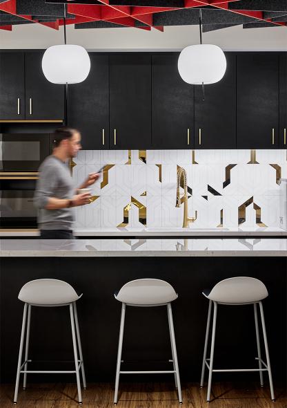
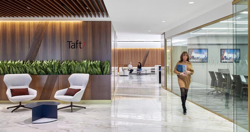
Following their client-first mindset, one of the main goals for the three consecutive floors was to incorporate a client experience center, which HED oriented to take advantage of the iconic views of the Chicago River, Michigan Avenue, and the lake. Looking to host an array of events from social hours to depositions to presentations by prominent political figures, the space is flexible, welcoming, and well branded. A generous reception area with a coffee bar and ample seating for guests welcomes visitors and staff and features a backlit metal ceiling that takes cues from the neighboring waterways. Adjacent to reception is a lounge outfitted with hidden technology and furniture on wheels to allow the space to be transformed to serve multiple functions, and a sculptural stone and metal bar is connected to a catering pantry for hosting evening events. The iconic “slash” that is part of the Taft logo was used as inspiration for several elements of the design, from the flooring pattern that guides people through the space, to the canted flutes on the walnut paneling which are also an homage to the firm’s history and heritage.
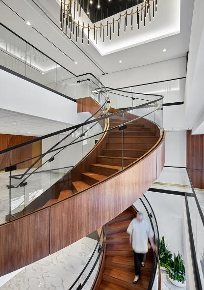
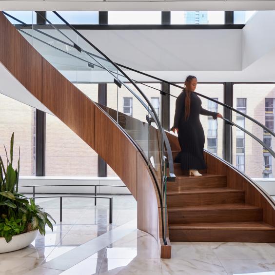
To celebrate their outstanding workplace culture, the renovation had to accommodate top-of-the-line amenities, an office for every attorney, and an impactful way to connect all three floors. To accomplish this, a new opening in the floor slab was cut to accommodate an extra level to the stair. Connecting all three floors, the stair was re-imagined with a minimal aesthetic in mind, with curved glass railings, walnut stringers and black metal accents that play off the building exterior. The stair acts as the heart of the space and serves to bring together the practice groups assigned to different floors. A 10-foot custom light fixture follows the spiral shape of the stair and is a modern interpretation of the traditional chandelier. To create offices for each attorney, several interior rooms were demolished, allowing all interior offices to feature full glass fronts to take advantage of borrowed light and connect the attorneys to each other.
